
Checklist – visualizations
Ensure that each visualization includes and accurately reflects the following elements:
– The selected graph is the best option for representing this data
– All numbers double-checked
– Spell check
– Headline/title
– Correct units of measurement
– Description of what the x- and y-axis represent
– Y-axis starts at 0 (If not: Is it clearly shown? Does the editor agree?)
– Conscious choice of colours (explained on request)
– Source
– Instructions for use (if the graph is interactive)
– Context or explanation (if necessary)
– Byline
– Accessibility (contrast, caption for screen readers, attached table etc) (explained on request)
– Understandable for someone who sees the visualization for the first time (show it to someone outside the newsroom)
-The visualization checked on a mobile device
Assignment 1
The selected graph is the best option for representing this data as it clearly illustrates the development of operational nuclear reactors worldwide. All figures were double-checked against the original data for accuracy. I adjusted the timespan on the x-axis to begin in 1954 and end in 2023 to avoid potential misinterpretations. The headline is clear and to the point. Additionally, I included a note to explain the significance of the data and an annotation highlighting the peak in 2018, which is further elaborated in the description. To enhance accessibility, I used a high-contrast red color that was verified for colorblind compatibility. The Datawrapper high-contrast theme was also applied to ensure the graph is easy to read. Furthermore, I added a detailed description for screen readers to improve accessibility. The checklist was used to ensure that the graph is of high quality.
The column chart effectively represents the data. To clarify that each column represents the number of nuclear reactors, I added a label indicator. The headline is clear and accurately communicates the chart's purpose. I included a description to explain the significance of the data and adjusted the y-axis scale to prevent potential misinterpretations. For accessibility, I selected a high-contrast red color verified for colorblind compatibility and applied the Datawrapper high-contrast theme to ensure readability. Additionally, I provided a detailed description for screen readers to enhance accessibility further. The checklist was used to ensure that the chart is of high quality.
- Reflections
Checklist:
Have you followed the checklist for visualizations (every step)?
Yes, I followed all the steps in the checklist. Having a checklist prepared in advance was extremely helpful in ensuring that all the elements were of high quality.
Colours:
How easy or difficult is changing colours using the tool?
I didn’t encounter any issues with changing colors.
Text/Labels:
How easy or difficult is it to work with text and labels in the tool?
I didn’t find it difficult to work with text and labels. However, it took me some time to figure out how to add an arrow to the annotation. Fortunately, I found clear instructions for this in the Datawrapper Academy.
Flexibility:
How flexible are the tools? Can you make the changes you need?
In my opinion, Datawrapper is not very flexible. The available choices are limited, and I couldn’t find solutions for adding features not included in the tool. While its simplicity makes it easy to use, this also reduces its flexibility.
Accessibility:
What are the different accessibility options provided by the tools?
Due to its simplicity, the accessibility options are somewhat limited. However, the tool does include helpful features such as a high-contrast theme, a colorblind check, and the ability to add alternative text.
Smartphone:
How do the charts appear on your smartphone? Have you faced any issues while accessing them?
The tool offers a smartphone-friendly version that displays charts and graphs clearly. However, the spacing on the sides feels a bit tight.
Assignment 2
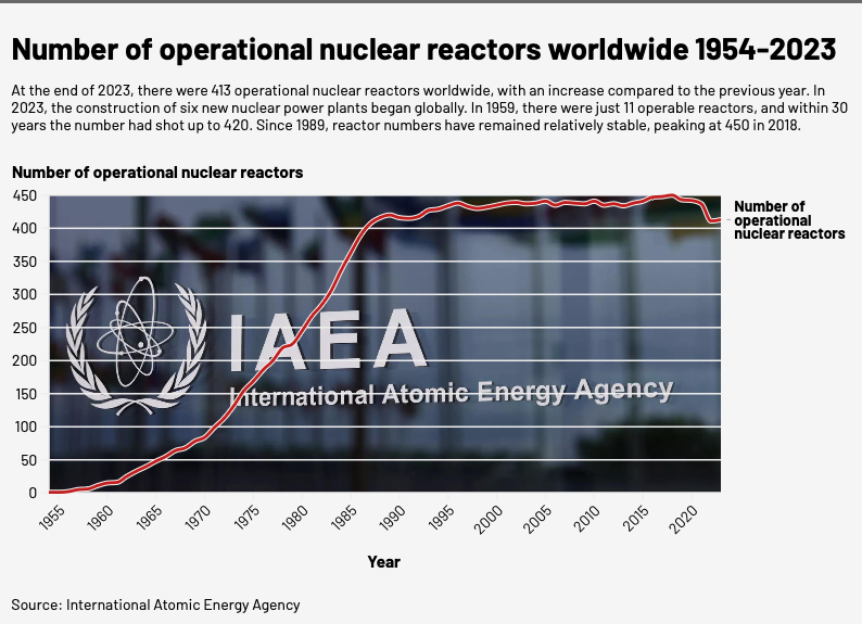
<div class="flourish-embed flourish-chart" data-src="visualisation/20516784"><script src="https://public.flourish.studio/resources/embed.js"></script><noscript><img src="https://public.flourish.studio/visualisation/20516784/thumbnail" width="100%" alt="chart visualization" /></noscript></div>
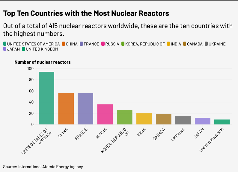
<div class="flourish-embed flourish-chart" data-src="visualisation/20517430"><script src="https://public.flourish.studio/resources/embed.js"></script><noscript><img src="https://public.flourish.studio/visualisation/20517430/thumbnail" width="100%" alt="chart visualization" /></noscript></div>
- Reflections
Checklist:
Have you followed the checklist for visualizations (every step)?
Yes, I followed all the steps in the checklist.
Colours:
How easy or difficult is changing colours using the tool?
I didn’t encounter any issues with changing colors.
Text/Labels:
How easy or difficult is it to work with text and labels in the tool?
I didn’t find it difficult to work with text and labels. However, I didn’t manage to make an annotation. I would say that Flourish is much more complex than Datawrapper and there are more options for both colours, labels and texts.
Flexibility:
How flexible are the tools? Can you make the changes you need?
As said above, I would say that Flourish is more complex than datawrapper and it provides more options and features. However, it is difficult to navigate before knowing the different functions.
Accessibility:
What are the different accessibility options provided by the tools?
Flourish lacks options for accessibility. The only feature I could find that was useful to me at this stage was the alternative description for screen readers.
Smartphone:
How do the charts appear on your smartphone? Have you faced any issues while accessing them?
The tool offers a smartphone-friendly version that displays charts and graphs clearly.
Assignment 3
In what context do you think Datawrapper is the best tool, and why? When would you not use it?
When you need to produce simple visualizations that don’t request a lot of details in the appearance.
What are the main benefits of using Datawrapper?
It is effective in the sense that you don’t need to put a lot of energy into navigating the tool. This could be a good thing in stressful situations.
In what context do you think Flourish is the best tool, and why? When would you not use it?
It is a good tool for the need of details. Also if you need to follow a specific style code I guess that it could be more helpful than Datawrapper.
What are the main benefits of using Flourish?
You have a lot of options and functions that can help you present the data in an accurate, but also eye-catching, way.
Which of the tools do you personally prefer so far?
I would say I prefer Flourish, although I feel I need more practice to use it effectively and make the most of its advanced features.