
Checklist – visualizations
Ensure that each visualization includes and accurately reflects the following elements:
- The selected graph is the best option for representing this data
- All numbers double-checked
- Spell check
- Headline/title
- Correct units of measurement
- Description of what the x- and y-axis represent
- Y-axis starts at 0 (If not: Is it clearly shown? Does the editor agree?)
- Conscious choice of colours (explained on request)
- Source
- Instructions for use (if the graph is interactive)
- Context or explanation (if necessary)
- Byline
- Accessibility (contrast, caption for screen readers, attached table etc) (explained on request)
- Understandable for someone who sees the visualization for the first time
(show it to someone outside the newsroom) - The visualization checked on a mobile device
Assignment 1
Datawrapper
a)
As noted in Alan Smith’s “How Charts Work”, line charts remain the “heavy lifters” of the chart world – because so much of our interest in data lies in how it has changed over time (58). However, when creating this chart I had to give it some extra thought to convey more detailed, useful information. I chose the colour “chartreuse” (halfway between yellow and green) because nuclear power it is often associated with it. I then decided to show on the timeline those values that allow the reader to grasp at a glance the size of the change over time. I filled a specific area in my chart (2018-2023) because it allows for quick identification of patterns and fluctuations in the dataset. Additionally, filled areas facilitate comparisons, illustrating part-to-whole relationships effectively.
The chart is also interactive, meaning that it allows viewers to easily track by themselves fluctuations and identify significant changes in data over a specified period. I added a few annotation using the metadata from the PRIS dataset to explain the reasons behind significant changes.
b)

To create this chart I chose to compare the net of the electrical capacity in 10 different countries. After conducting an analysis of the global energy landscape, I categorized these nations into pro-nuclear and anti-nuclear groups to effectively illustrate their varying approaches to energy production.
I chose France, which is the European leader in nuclear energy; Germany, which is transitioning away from nuclear power; Spain for it is against nuclear power. In contrast, the pro-nuclear countries outside Europe are Russia, that continues to expand its nuclear capabilities both domestically and internationally; South Korea which relies heavily on nuclear energy for its electricity needs; China, which has recently increased its investments in nuclear energy; Canada, and of course the United States, home to the largest number of operational nuclear reactors in the world: the major advocate for nuclear energy.
I also included Japan in my analysis due to its unique circumstances following the Fukushima disaster in 2011. This incident prompted a reevaluation of Japan’s energy policies and led to a reduction in nuclear power generation. I couldn’t leave out Belgium for a similar reason: the country presents a complex case in the nuclear debate after the Russian invasion of Ukraine.
To create the chart I used the color red for the USA since red is a pre-attentive color and I wanted the viewer to notice that the USA energy values remain stable throughout the entire time span taken into consideration. For the other countries I used the color green because these two opposite colors generate a dynamic tension that can enhance visual interest. The chart is dynamic: the viewer can click on each year to see changes in all countries in real time.
c)
• Have you followed the checklist for visualizations (every step)?
— YES
• Colours: How easy or difficult is changing colours using the tool?
— VERY EASY
• Text/Labels: How easy or difficult is it to work with text and labels in the tool?
— I HAD NO DIFFICULTIES, THE TOOL IS VERY INTUITIVE
• Flexibility: How flexible are the tools? Can you make the changes you need?
— FLEXIBLE ENOUGHT FOR MY NEEDS. NOT HAVING A TECHNICAL BACKGROUND WAS NOT AN ISSUE WITH THIS USER-FRIEDLY TOOL.
• Accessibility: What are the different accessibility options provided by the tools?
— ALTERNATIVE TEXT DESCRIPTIONS, ALLOWING USERS TO ADD TEXT DESCRIPTIONS FOR SCREEN READERS; COLORBLIND CHECK; DATA DOWNLOAD OPTIONS: THE TOOL PROVIDES A LINK FOR USERS TO DOWNLOAD THE DATA; RESPONSIVE DESIGN: THE VISUALIZATIONS WORKS WELL ON DESKTOPS, TABLETS, AND SMARTPHONES; FALLBACK DESCRIPTIONS: OFFERS DEFAULT DESCRIPTIONS FOR VISUALIZATIONS WHEN ALTERNATIVE TEXT IS NOT PROVIDED.
• Smartphone: How do the charts appear on your smartphone? Have you faced any issues while accessing them?
— NOT GREAT. I FAILED TO UNDERSTAND WHY. I ENSURED I WAS USING THE RESPONSIVE IFRAME EMBED CODE PROVIDED BY THE TOOL BEFORE PUBLISHING IT.
Assignment 2
Flourish
a)
While creating my line chart with Flourish, I decided to use the color red as it is a pre-attentive color and to use it on a opaque and neutral background. I then decided to use as part of the background an picture of a nuclear power plant in order to make the chart more appealing to the viewer. Before uploading the image I modified it with a fade effect on Canva: a faded background helps to keep the audience’s attention on the main content, rather than on the background image itself. I tried to make all the years visible on the X-axis like I did with Datawrapper but without any success. On the other hand, I could name the X-axis with “Year” (not really fundamental, but this was not an option in Datawrapper so I wanted to give it a try). I tried to place annotations next to the timeline, but this is a feature that on Flourish is only possible when creating a Story (image below). That is also why I decided to add a short descriptive text under the headline that guides the viewer through the most significant shifts over the 7 decades.
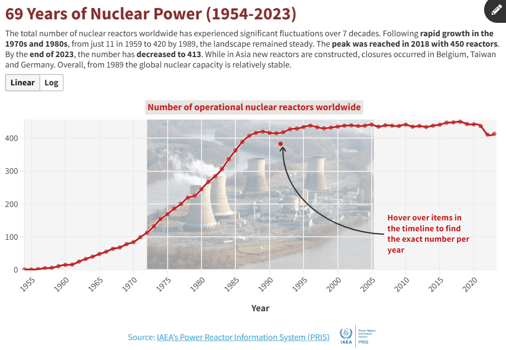
b)
Here again I compared the same countries in the chart above. I wanted to use the color blue this time because it is often associated with calm and professionalism; and would have liked to use “Custom overrides” in the Colors section to turn into red the USA column, but it didn’t work. I then selected a palette with basic color terms and to make the chart interactive: every time the viewer clicks on a different year, the chart changes the colours and the values automatically. As I did earlier with the Datawrapper chart, I decided to put on display the different energy values at the top of each column. On the Y-axis I specified which unit of measurement the values referred to in order not to take anything for granted. Since in every chart of ranking the context is even more fundamental, I wrote a brief overview of the current electricity production landscape to explain why certain countries have experienced abrupt decrease phases.
c)
- Have you followed the checklist for visualizations (every step)?
— YES - Colours: How easy or difficult is changing colours using the tool?
— NOT ALWAYS USER-FRIENDLY IF YOU ARE JUST STARTING OFF USING THESE TOOLS - Text/Labels: How easy or difficult is it to work with text and labels in the tool?
— NOT ALWAYS EASY. SINCE FLOURISH PRIMARILY FOCUSES ON VISUAL STORYTELLING, IT SEEMS TO ME IT LACKS ROBUST TOOLS FOR ADDING DETAILED ANNOTATIONS DIRECTLY WITHIN THE VISUALIZATIONS LIKE I MENTIONED ABOVE WHEN DESCRIBING THE LINE CHART. THIS LIMITATION CAN MAKE IT CHALLENGING FOR USERS WHO WANT TO PROVIDE CONTEXT OR COMMENTARY ALONGSIDE THEIR DATA POINTS; ESPECIALLY FOR THOSE WHO DO NOT KNOW HOW TO USE ADOBE ILLUSTRATOR TO ADJUST THEIR CHARTS TO THEIR NEEDS. - Flexibility: How flexible are the tools? Can you make the changes you need?
— NOT VERY FLEXIBLE. ALTHOUGH IT PROVIDES SOME CUSTOMIZATION OPTIONS FOR COLORS, I FELT I HAVE LIMITED CONTROL OVER OTHER DESIGN ASPECTS, SUCH AS SPACING AND LAYOUT ADJUSTMENTS. FOR EXAMPLE I COULDN’T INSERT THE DATE 1954 E 2023 IN THE X-AXIS, WHILE WITH DATAWRAPPER I COULD. IT IS POSSIBLE THAT I COULD NOT FIND A WAY TO DO SO, BUT I SPENT QUITE SOME TIME ON IT AND YET I COULDN’T FIND A QUICK SOLUTION. I ALSO WANTED TO WRITE AN ANNOTATION EXACTLY WHERE I WANTED IN THE CHART, AND IT WOULD LET ME DO SO ONLY IN THE STORY FORMAT. - Accessibility: What are the different accessibility options provided by the tools?
— BUILT-IN SUPPORT FOR SCREEN READERS. USERS CAN ALSO ADD DESCRIPTIONS FOR VISUAL ELEMENTS, ENHANCING COMPREHENSION FOR VISUALLY IMPAIRED INDIVIDUALS; COLOR-BLIND-FRIENDLY PALETTES; - Smartphone: How do the charts appear on your smartphone? Have you faced any issues while accessing them?
— JUST FINE. NO ISSUES.
Assignment 3
Comparison
- In what context do you think Datawrapper is the best tool, and why? When would you not use it?
— Definetly good in contexts where quick, straightforward data visualizations are needed, especially for news articles, reports, and presentations. It enables you to create in no time clear and responsive charts, maps, and tables that are easy to embed in online content. Datawrapper may not be the best choice for projects requiring complex interactive features. It is less suitable for highly detailed visual storytelling that demands advanced design capabilities or animations. - What are the main benefits of using Datawrapper?
— It is very intuitive and it has a responsive design: visualizations automatically adjust to different screen sizes, ensuring accessibility across devices. Another main benefit: the annotation features. No coding skills needed. All visualizations are 100% free of tracking, cookies, and third-party scripts. Power Point integration. - In what context do you think Flourish is the best tool, and why? When would you not use it?
— Ideal for creative projects that require visually engaging and interactive data presentations. Personally, I wouldn’t recommend Flourish to someone who doesn’t know how to use Adobe Illustrator (or similar tools). Since a good graphic doesn’t just consist of visualization per se, but also of added annotation, the fact that Flourish free plan is not so flexible, represents a problem. In addition to that, with the public free plan you can do many things, but if you’re not using open source data, you must be aware that all the data becomes publicly available. - What are the main benefits of using Flourish?
— Its wide array of chart types (and animated viz) that enables unique visual storytelling. Even if you only use it with a free plan, the platform provides numerous templates designed for specific use cases, simplifying the creation process. Also: its integration into Canva. - Which of the tools do you personally prefer so far?
— Datawrapper! Its user-friendly interface allowed me to produce professional-quality visualizations even if I do not have extensive design skills. Although, I must admit that Flourish is way better in terms of aesthetics. It offers a wider variety of creative chart types, which allow for more visually engaging presentations of data as already mentioned above.