
Good examples of data journalism: https://www.ft.com/content/42bbe534-8a0d-4ba8-9cc6-f84936d87196
The article “The Israel-Hamas war – in maps and charts” from the Financial Times, gathers a total of eight maps, four graphs, and one timeline of key events to outline the war between Israel and Hamas, and Israel and Hizbollah.
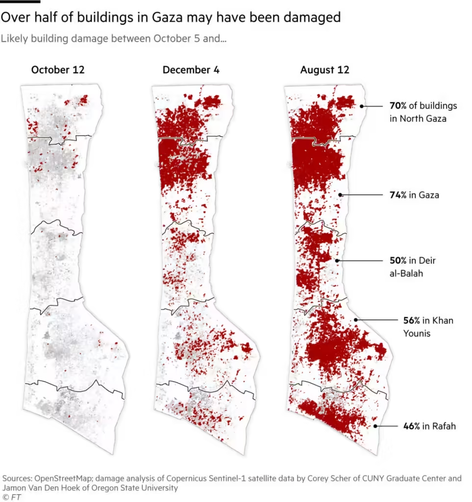
The maps can be divided into different topics: attacks and building damage in Israel and Lebanon; fuel/electricity shortages and infrastructure damage in Gaza. Additionally, two of these are satellite maps of detected conflict and its location. This makes the geography of the war and its consequences easily understandable, especially for readers who might be confused about it.
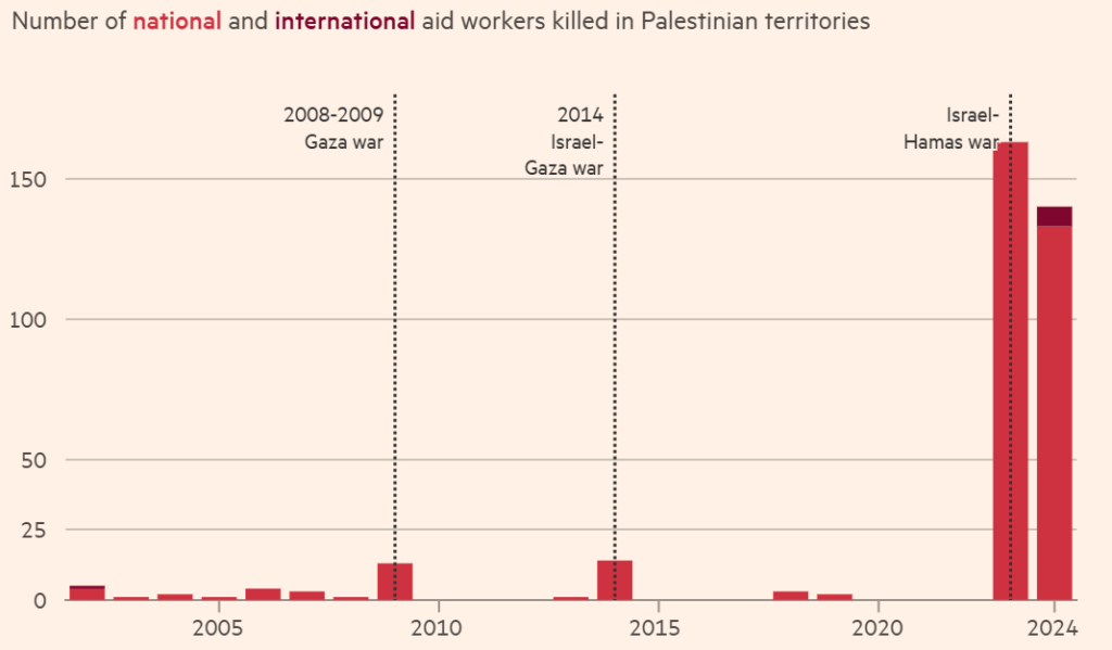
The graphs tell the story of the death toll of Palestinians and aid workers in Gaza through different stages of the conflict, showcasing in a straightforward way these unprecedented numbers. Others include food insecurity and daily aid delivery in Gaza, deepening the context of the life of Palestinians.
Overall, this is a good example of data journalism. The data visualization is simple and understandable, does not recur to extravagant maps/graph formats, and still maintains its shock factor. It dives deeper into the issue by bringing food insecurity and fuel/electricity shortages into the conversation.
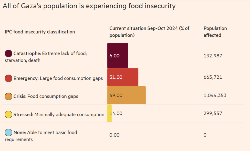
However, the graph “All of Gaza’s population is experiencing food insecurity” could be better explained. The categories “stressed” and “catastrophe” represent 14% and 6% of the population, respectively, but in the latter, the line is significantly bigger than in the first, which can be confusing.
Finally, the journalists keep their sources transparent by revealing where which data set came from, and how it was gathered.