
“The Counted,” by The Guardian, is a groundbreaking piece that began in 2015 to document and analyze police killings in the United States. It was, at that time, an effort to count those killed by police because there was an absence of reliable statistics from official sources. To date, The Guardian has compiled its data from the following additional resources: news reports and official police statements, local and national media coverage, reports from advocacy groups, and public records.
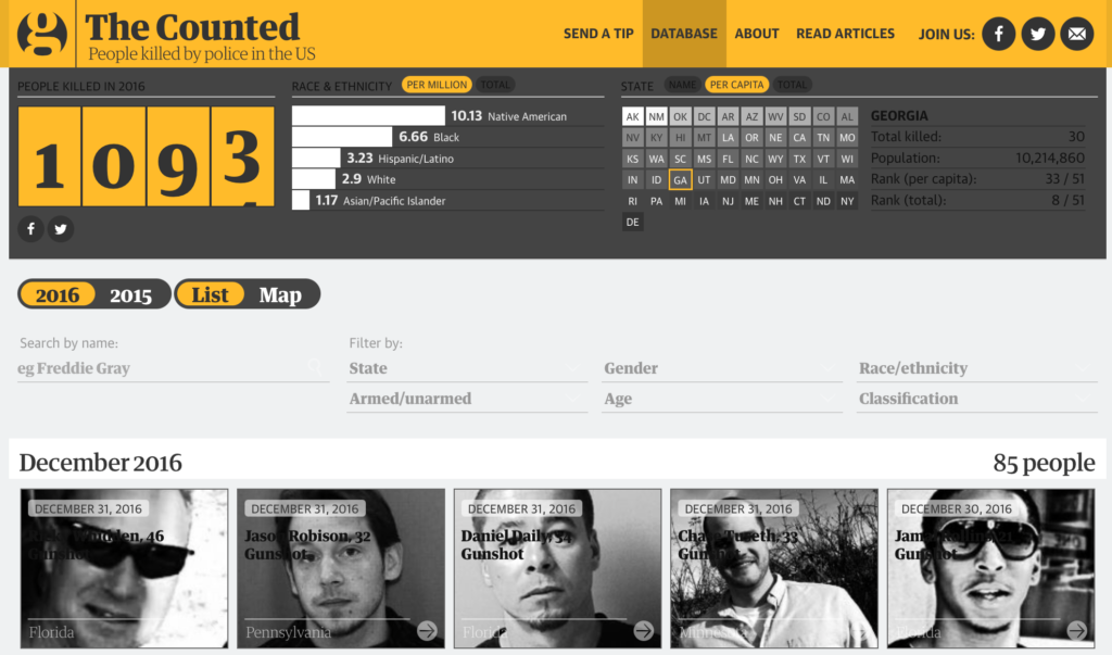
By allowing the public to submit information about police killings, the project opened itself to crowdsourced data collection and upped the ante on the number of incidents reported, directly engaging the community in the investigation. Demographic status regarding age, gender, and race, nature of death, whether the armed or unarmed and the type of incident; it was also of concern to know the geographical location, thus identifying the city and state where each occurrence happened.
“The Counted” added interactivity to the presentation of the data, mapping, charting, and graphing the information for better appeal and understanding of such complex information. That makes it very easy for readers to explore patterns and trends in police killings.
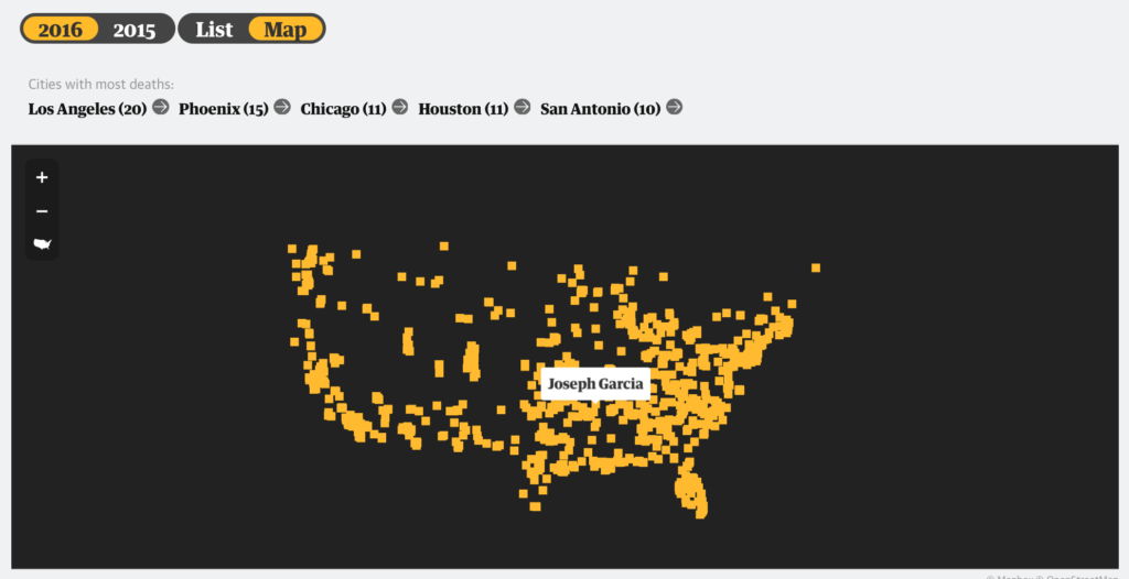
From my point of view, this journalistic work achieved the highest possible standards of data journalism, by means of excellent data collection, transparency, and inclusion of the public in the investigation process. The great use of interactive visualizations drove home important conversations about police violence and police accountability in the United States.
Access and explore the full project and the interactive features here.