
Sara Oliveira

Good examples of data journalism: https://www.ft.com/content/42bbe534-8a0d-4ba8-9cc6-f84936d87196 The article “The Israel-Hamas war – in maps and charts” from the Financial Times, gathers a total of eight maps, four graphs, and one timeline of key events to outline the war between Israel and Hamas, and Israel and Hizbollah. The maps can be divided into different topics: attacks … Read more
Eden Maclachlan

The wealth divide linked to 370 heat deaths in New York each year – https://www.theguardian.com/us-news/2022/sep/07/new-york-heat-deaths-map-inequality This article from The Guardian focuses on the link between poverty and heat in New York City. It intends to map which neighborhoods should the highest heat burden. Two visualisations of NYC seem to suggest a clear correlation between warmer … Read more

Matthijs Touw

Good example of data journalism: https://www.nytimes.com/interactive/2023/07/28/business/starlink.html This article highlights the dependency of the Ukrainian military on Elon Musk’s network of satellites in the war in Ukraine. It highlights the struggle between being too dependent on one companies network, while also showing it is the most extensive network available in remote areas, and during war time. … Read more

Maite Allerborn Ibañez

GOOD EXAMPLE OF DATA JOURNALISM The above article describes the consequences of war after one year in Gaza. The article includes data on the amount of killed people, journalists, destructed buildings, missed people, infected people, food insecurity, access to clean water, imprisoned palestinians, amount of explosives dropped, etc. I believe this is a good example … Read more

Hedda Berg

Good Examples of Data Journalism : https://www.dn.se/klimatet-just-nu/ This page from Dagens Nyheter showcases different threats and implications of climate change and it is updated everyday, to follow the development. I believe that this is a good example of data journalism as the information is presented in a clear way, especially with the usage of color, … Read more

Erin Rizzato

https://www.technologyreview.com/2019/10/17/75285/ai-fairer-than-judge-criminal-risk-assessment-algorithm This article by Karen Hao and Jonathan Stray from the MIT Technology Review uses very good visualisations to explain the ethical and practical dilemmas that the US criminal legal system encounters when using predictive algorithms. The visualisations are interactive and lead the narrative of the story, rendering very complex issues more accessible to the … Read more

Rodrigo Ribeiro

Although this article is overloaded with numbers and visualizations, it’s extremely good at using them to convey a narrative and linking an otherwise quite theoretical framework of election numbers and public opinion into one single map that changes depending on variables that are linked to our daily lives like grocery stores and restaurant chains. It … Read more

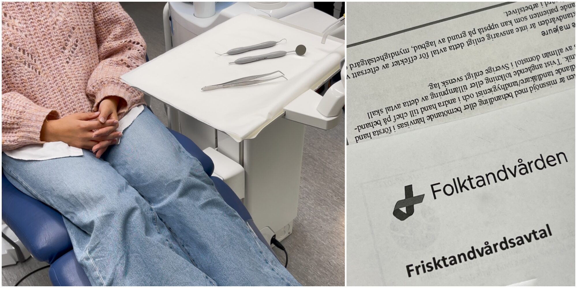
Frisktandvård – Young swedes and the quest for a sought-after contract

By: Clara Fors Wisbyse, Rodrigo Ribeiro, Hanne De Coninck and Yang Liu A newly proposed change to the dental system could result in young people getting stuck in long queues. Despite efforts to reduce dental queues in Västra Götaland, young people in the region’s rural areas face an important challenge.  “I can understand if there’s … Read more